Typography Practical - Horror
Even though at this point in time my group have chosen to film a trailer for an urban drama film, I chose to do one for a horror movie as it gives us more options if we want to switch to horror.
 |
| Firstly I started off by changing the background to black in order to create the gloomy and dark effect I wanted for the background as this is a typography for a horror film. |
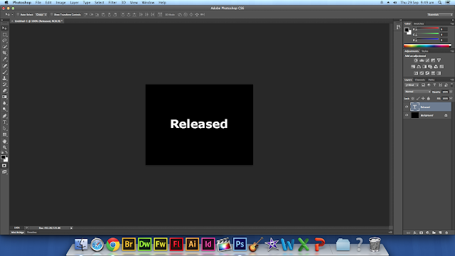 |
| Secondly I proceeded to write the title I have chosen which is 'Released' in the Verdana font. |
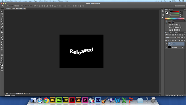 |
| Thirdly I then proceeded to give the text the spooky warp effect. I was able to do this by clicking the window drop down at the top of the screen and then clicking character, this then gave me the option to highlight the letters i wanted to move up or down by setting the baseline shift. In order to further warp the text, I highlighted the text and clicked the create warped text button, chose the style to be 'rise' and then made the bend 10%. |
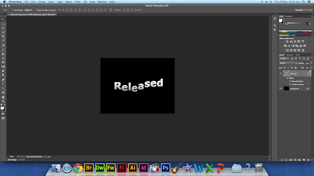 |
I then went clicked the fx button and chose the gradient overlay, i then changed the blend to normal, made sure the opacity was 100% and then proceeded to change it to the preferred colour. I then put a tick against 'bevel and emboss' and changed style to inner bevel and the technique to chisel hard. I then increased the font size from 48 to 60.
I then clicked the button in the top right of the layers tab and clicked 'Convert to smart object' so that i am able to add filters to it. I then copied my typography 3 times by clicking command + J. I then named each title as shown above in the screenshot.I then went to 'filter' then 'blur' then 'radial blur' |


No comments:
Post a Comment