In class we where given some time to edit a title of our choice. As I was doing an urban drama I thought I would do a graffiti like text. We had to use Photoshop for our typography. As I haven't used Photoshop much it took some time to get use to the diversity of the program but I ended up with an effective piece which looked very retro in its design.
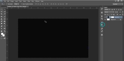 |
I started te editing by downloading a font from da font. After this I put it into Photoshop and selected a few layer I could use for multi editing. I then set the background colour of the first layer to black so my typography would stand out.
|
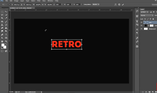 |
| I wrote a text box with the text tool and then used to downloaded text to write out the word 'Retro' in all caps. I did it in all caps because this would make it easier for me to edit. |
 |
| I then changed the colour of the text from red to white so it would contrast the background the most. I also expanded the text so it was bigger and mire visible. I then also centred the text both vertically and horizontally so it sat exactly in the middle of the layer I had created or it. This was so it was more ecstatically pleasing. |
 |
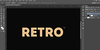
| After this I then duplicated the layer so I could get the same writing in the same size. I moved tis new layer a bit blow and to the right of the last. I changed the colour of the text as well so it looked like a shadow of the first. |
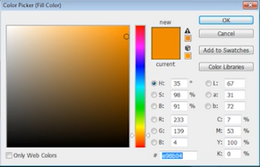 |
| After I had done this with the writing I had to make sure I had saved the colour. I used multiple tools to first identify the colour I had used and then save it to a palate. I did this for the next step because I would need this colour again. |
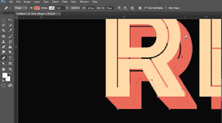 |
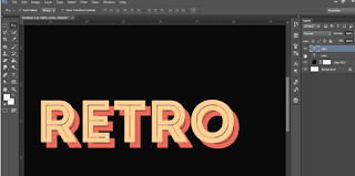
| I then when about making it look like both words where connected to each other like an actual shadow. I used the pen tool to select the ends on the letters and join them together. After connecting all angled edges I draw on the background layer so it would fill in all the gaps aground the later that was black. This means that the colour red would be behind all the gaps lie a real shadow. |
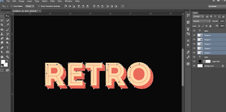 |
| After doing all this editing this is what the final text will read and look like. I like it looks effective but I may do some more experimenting with other colours as it doesn't look all that pleasing. |


No comments:
Post a Comment