Friday, 10 February 2017

Poster construction

 Poster Construction 

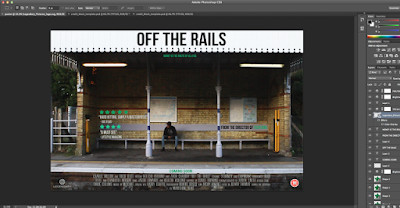
Firstly I started off by inserting the photo,in which we went to Bearsted train station in order to take. We used this for the background. I then realised that the picture was slightly dark, especially in the part above the main character's head, in order to remedy this, I adjusted the brightness of the image, but just enough to conform to that of the urban drama genre (shouldn't be too bright and should have some hints of darkness).  I also changed the saturation and vibrancy of the image. This resulted in certain colours becoming more noticeable and vibrant (such as yellow).  I then decided to sharpen the image I did this by going on smart sharpen and adjusting it so that it looked more professional and clearer.
I then added our title at the top of the page in a bold impact black font which contrasts with the white background behind it making it stand out more. And also put the tagline just below this in a smaller font and in green writing as this correlates with our websites colour scheme of green, white and black. I also added coming soon at the bottom of the poster, the age rating and production company logos in the bottom right of the poster and also added 'From the director of Fishtank' in green and black in the middle right of the poster.

I then found a billings block template on a website called ' Video copilot' and downloaded this template, imported it into Photoshop and integrated our own roles and names into it. After finishing this I imported it into our poster and placed it at the bottom, under coming soon.

 Here we were close to finishing, however we felt that some of the text did not work well with the background. We decided to change the critics reviews to white as the part of the poster they were placed in were darker and therefore black text would have been harder for the viewer to read. We chose to change the colour to white as we thought it stands out more and would be easier for the viewer to read. I also moved the coming soon text lower down which was the last change needed.
Finished poster can be viewed below:


No comments:

Post a Comment