
Showing posts with label Charlotte Wilson. Show all posts
Showing posts with label Charlotte Wilson. Show all posts
Friday, 31 March 2017

Thursday, 30 March 2017
Evaluation Questions
Question 1
In what ways does your media product use, develop or challenge forms and conventions of real media products?
In what ways does your media product use, develop or challenge forms and conventions of real media products?
Question 2
How effective is the combination of your main product and ancillary texts?
Question 3
What have you learned from your audience feedback?
What have you learned from your audience feedback?
Question 4
How did you use media technologies in the construction and research, planning and evaluation stages?
How did you use media technologies in the construction and research, planning and evaluation stages?
Tuesday, 21 February 2017
Audience Feedback
Audience Feedback
After completing our teaser trailer, poster and website we received some feedback from fellow A Level media students within our class. Each group showed their promotional package to the class where we wrote feedback which was good things about it and things which needed to be improved.
These were of our feedback sheets.


After looking at the feedback in our groups we found some trends, we found the things our peers liked within our trailer was the music that it worked well with our genre, the fast paced editing, range of camera angles, was conventional to genre, good use of props and locations, the voiceover and a clear narrative, typography montage and they specifically liked our shot we filmed in the fridge and mise en scene of graffiti on the wall.
However there was some areas for improvement they found which was that the voice over needs to be a bit louder, some of the transitions of shots were a bit too abrupt and the fades need to be smoother as well as fading the music as the end, the titles were a bit bland, that the paper rustling was too loud and to spread our voiceover out.
We then looked at the feedback from our poster, the positives we found was a good tagline was relevant to the storyline, the colour scheme with the use of black white and green being conventional to the genre, the placement of our poster, how we laid it our worked well, good use of image was taken well and work around the information on poster and the critics reviews worked well with the genre of urban drama.
The negatives was that the tagline was maybe a bit too small and to make it slightly bigger, that the green colour on the word 'Fishtank' on the bench was hard to read and some of the greens look slight different shades.
Finally we looked at our feedback from our website, we found they liked the moving image we chose, the same colour scheme for our poster, critics reviews, layout, same typography used throughout our package, how the trailer was placed in the window of our train window, how the video was on loop and that it was conventional.
Our improvements were to move our text slightly down so that it can be seen better on a different background colour, to make the trailer slightly bigger and move the bottom of the website up higher so the viewer doesn't have to scroll.
After looking at our feedback we then assigned roles within our group to each improve something within our promotional package. My job was to improve the poster, this was by adjusting some of the colours and sizes of text on it.

The first thing I did was look at the size of the tagline, I selected it and started adjusting the size making it bigger, we then decided it looked fine how it is as a convention of our poster is to have a small tagline so we stuck to this as it was still clear to read.

I then went to look at the different shades of green feedback on the stars we received, I went on to one of the stars where I went onto colour picker I clicked on one of the stars from the row above where it gave me the exact colour which was already a match with the other stars already. I doubled checked this by selecting the text which also had the green colour and this was also the exact same colour green. We decided that the green shades may had looked a different colour due to where they was placed, for example where the colour is place on a slighter part of the poster it looked a different shade to the colour on a darker background.

Finally I looked at the word 'Fishtank' on the bench which is apparently hard to read. I adjusted the colour and changed it to black to see what this would look like as I knew it would be able to be seen clear and is the colour already used in the sentence.

This was what the back colour then looked like on our poster, we decided we didn't like it and preferred it when it was the green colour as it stood out and included more of our selected colour as well as catching the viewers eye. So I went back on to colour selector when I match it up with the same green used throughout however I made it slightly darker which made it clearer to see. We also felt the word couldn't be seen well due to the projector used to show our poster on.

This was the finalised poster.
Thursday, 9 February 2017
Poster Practical - Part two
Poster Practical - Part two
After the first stages of the poster which was adding in the image editing it and the title and age rating I went onto to do more.
After the first stages of the poster which was adding in the image editing it and the title and age rating I went onto to do more.

First of all I changed the font of our title to our chosen font that is 'Bebas Neue' I downloaded it on to the mac where I could access it from Photoshop. By having the font downloaded I was able to add in the rest of the text onto the poster such as the tag line that is 'Money is the route of all evil' I made it smaller then the title as this is one of the conventions of posters. I made the colour green as this is our chosen colour for our film.

I then added in our 'By the director of' we chose the director of 'Fishtank' as its likely our film would be made by this producer as it is a low budget film. I thought it would look best on the bench where it would stand out, I decided to changed 'Fishtank' to our green colour just to add another aspect and incorporating our colour more. After that I put in 'Coming Soon' at the bottom in the same text and green, I went onto Google where I found our production companies logo that is 'legendary' I imported this into Photoshop and put in next to our age rating as this is where it usually is seen.

I added in our critics reviews which we had already planned out what they were going to say. I made sure they were in the right position for our poster and size, I had to move them down as you could see the black text on the black background. I then used the custom shape tool to add in the stars for the reviews this was hard as I had to make sure they were all the same size. When I added these in being 5 on the first review and 4 on the second I changed the colour of them to green, I used the selective colour tool where I went onto the tag line and selective the colour green I used on that so the same green could be used throughout.

I then searched for a billings block template and font, I finally found one on video co pilot after downloading the font and template I imported it into Photoshop.

I then edited the text relevant to our film such as our producers and actors. After typing the right text and editing it I copy merged it on to the poster. When it first went on the colour was too dark and made it unable to see, so I changed the colour to a light grey/white so that it was viable.

This was what the poster then looked like. We decided that we needed to have an aspect of the light grey/white somewhere else on our poster, we thought that our critics reviews was hard to read to changed them. We also decided that it didn't look right not having our title and tag line central with the pillars so we moved it over to be in line. I also changed our production company logo the other side to make it look even, I had to change the colour of it to the same white/grey as it wasn't visible.

This is our finishing poster.
Overall I am extremely pleased with how our poster looks, I had to be particularly careful with the colour scheme and placing's other wise it wouldn't of looked right. If I was to-do this again I'd use a clearer camera as our image is a litter bit bluer than I wanted, and I would of also paid more attention on the lighting as we had to work around the dark shadow. However I am happy with how it has turned our and feel it looks professional.
Wednesday, 8 February 2017
Editing Practical- Typography/Titles
Editing Practical- Typography/Titles
Within our teaser trailer I was assigned the role of sorting out the typography and titles. We didn't need many titles in our piece as we have a voice over explaining what is going on. However we did need to include some at the end of our trailer.
Within our teaser trailer I was assigned the role of sorting out the typography and titles. We didn't need many titles in our piece as we have a voice over explaining what is going on. However we did need to include some at the end of our trailer.

First of all I looked at different effects that could be used as our text appears at the end, we picked the one we thought would be most effective which was 'Dramatic'. This allows the text to come in quite sudden which works with the end of our trailer which is fast paced.

Luckily I had already down loaded the font that we have chosen to use throughout our promotional package that is 'Bebas Neue' also being a conventional font to our gene. The first title we wanted to include was the title of our piece that is 'Off The Rails'.

I then added in the second text which was 'Coming Soon' as its a tease trailer. We thought that it was a bit too fast and you didn't have enough time to read them so we tried blading it half way through and adding in black so that it took longer for the second title to appear. However this didn't work, we then tried dragging out the 'Dramatic' effect making it longer this work and will allow the viewer to be able to read our titles.
I am happy with how the titles look in our teaser trailer, I'm pleased that we have used the same font throughout our work as our audience will be able to identify our package as a whole by us used the same text, colour schemes and image. If I was to do this again I'd like to experiment with more titles, overall I am happy with our typography and text in our teaser trailer and am excited to see what the finishing product will look like.
Tuesday, 7 February 2017
Website Practical
Website Practical
After the shoot for our website images and videos we finally decided on the right one for our website which was of our protagonist sat at the train station the same image used on our poster apart from there is a train that moves in front of him. One of my group members uploaded the moving image and created tabs and social media links which led to other pages, I then took on the role of editing the text to the same one used throughout our poster and trailer, as well as the colour and positing.

Luckily I had already downloaded our font we chose that was 'Bebas Neue' onto the Mac, I then selected that font and type out our name of our film that is 'Off the rails'. I adjusted the size and placed it in the right position that is up the top in the center of our website, making It black so that it stands out.

I then went on to sort out the tabs, I changed the font and the size as well as the colour, which I changed to green as this is our chosen colour for our colour theme and is used on the poster. I made sure the tabs wasn't very big as they needed to be smaller then the title. When your on the selected page the tab turns to a dark grey colour so you know which page you are on while the others stay green.

I then started adding in critics reviews I added the same ones in from our poster however I didn't put the stars in as I felt this wasn't needed on our website. I made the colour green as you wouldn't be able to see it in black due to the background and being our selected colour. I also added in our age rating which is 18 in the right colour, I made sure this wasn't too big and so it looked more realistic.

I added in another critic review just above the other one in the same colour, font and size. I also added in our chosen production company in the opposite corner to our age rating. This is the same layout to our poster design so will be recognisable to people and will know what film it is.

I then added in the stars for our critic reviews I went onto shapes where I found the right star, after adjusting it to the right size I copy and pasted it so all the starts would be the same size.

After I had pasted all the starts I moved them into the right position above the reviews, I made sure there was 5 on the top review and 4 on the bottom as this is the same as our poster. It was also important that they was all in the right position meaning all in line.

I then changed the colour of the starts to green to match our theme colour. I selected the colour used on the text already on the website so it would be all the same green. I then decided that it didn't look right having the starts and review the same colour, so I changed it to white being the same as our poster and identifiably.

This was the finishing piece one I had changed the colours and placement of text so it could be read over our moving image. I am happy with our moving image it adds something different compared to just a still image website.
I am pleased with how the website design is looking, the final stage for the website will be to add in our teaser trailer and some final adjusts such as double checking the fonts are the right size and position. When these are done our website will then be complete.
Tuesday, 31 January 2017
Poster Practical
Poster Practical
In our promotional package for our urban drama teaser trailer 'Off the Rails' a poster is part of it. After doing our photo shoot at Bearsted train station to get our pictures I then started the editing process. I looked through the images that were taken on the day and decided on the one which looked best. We choose the image that is the same angle and location as the moving video that is used on our website so there is links between our package and people can identity them easily.

I then imported the image onto Photoshop where I adjusted the size of it, we decided to go landscape as most urban dram posters are that way.

After I saw that the image was slightly dark due to the roof above our protagonists head. So I adjusted the brightness making it lighter but not too light as It will make the genre look different such as a romance with bright lighting. I also changed the saturation and vibrancy bringing out certain colours in the image such as Hugo's clothes to make him stand out more and the yellows. I then decided to sharpen the image I did this by going on smart sharpen and adjusting it so that it looked more professional and clearer.
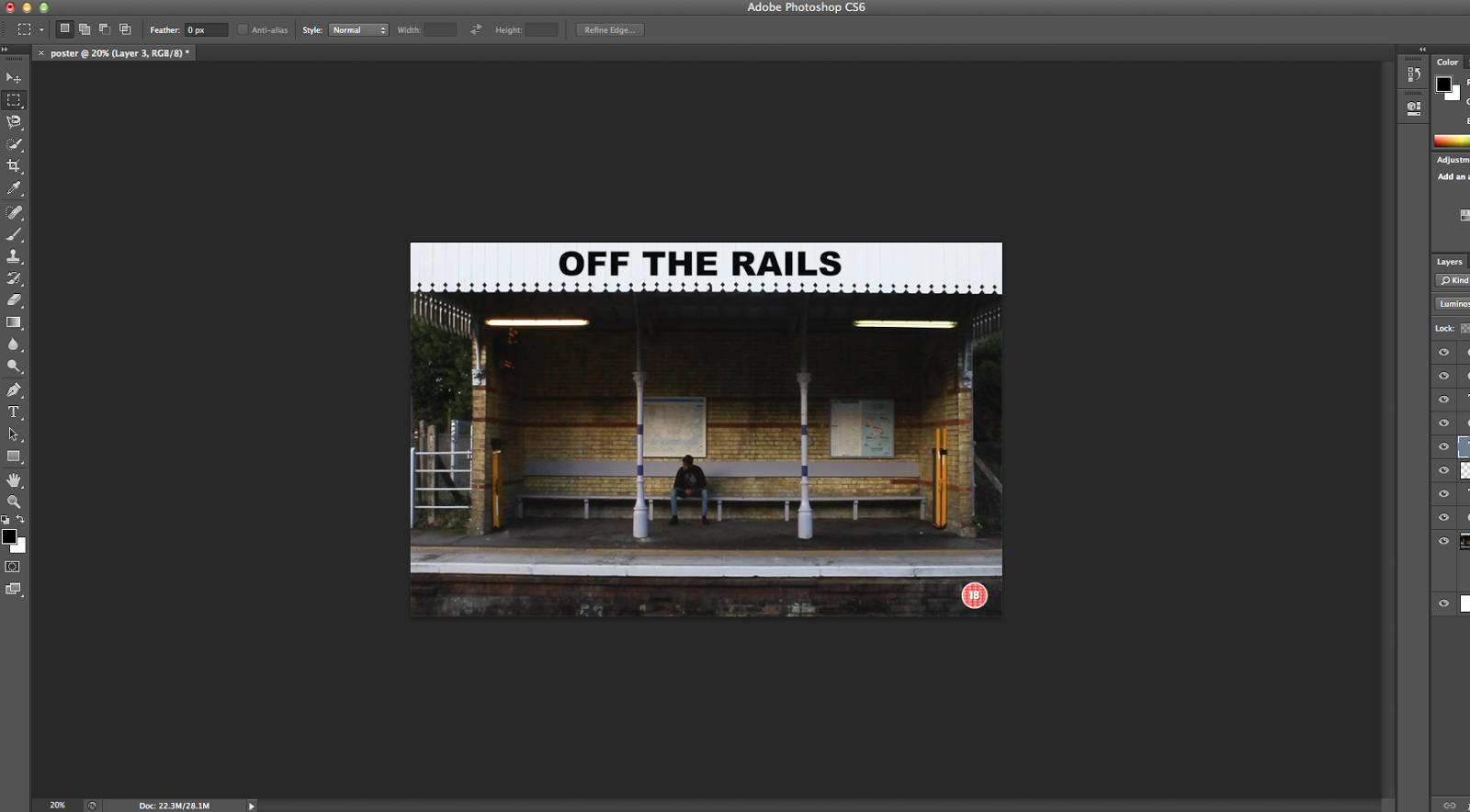
I then decided to add in and try out the title, I choose to put it on the white roof of the image as it will stand out the best there. I changed the size of the font so that it wasn't too big but still stood out. After adding in the title I then went onto Google where I found the 18 rating symbol, I imported it into Photoshop where I copy merged it on to the poster design. I made it smaller and placed it in the corner of the poster which Is on the design sheet we have crated but it also placed in the corner in a majority of other film posters.
Overall I am happy with how the poster has started to look, there is still a lot more to add on to it such as the tagline and billings. However I'm pleased with how the image has turn out with the colour changes, title and layout at the moment.
Thursday, 26 January 2017
Voice over Script
Voice over Script
In our teaser trailer we decided to use a voice over at the start, this is to explain to the viewers what is happening in the boys life for example we have shots of our protagonist opening his empty fridge and an empty wallet. The viewers may not exactly understand what is going on, therefore we included our voice over tell the audience that he doesn't have any money or food which can be shown in the line 'I may not have had much'. When the transition happens for when he joins the gang we need to explain to the audience why he has done this and why that's lead to his actions of crime and violence. This is explained within our voice over.
This is our voice over script-

We have tried to use words in it which links in with the scene which are happening at that time for example when it says 'getting good grades and surrounding myself with positive people' there are shots of the protagonist opening up his grade results and at the train station with his girlfriend. We have included the line 'Money is the route of all evil' as this is our tag line on our poster and website and will link in with the trailer as well.
We have used this voice over to explain to the audience what his life was like before he joined the gang, the scenes shown are also quite slow paced with some fades which works with the voice over which is spoken slowly. This is to contrast with the fast rapping music which is played over our fast paced montage.
The main character within our teaser trailer (Hugo) will be the one speaking our voice over we will recorded it on a microphone in a quite room where we wont encounter any disruptions. We need to make sure Hugo says it at the right pace to it fits in in time with the right scenes, we will do a few trail runs before we record the real one so it is perfect.
I am happy with how our voice over is however there are still a few lines we may have to add in if we need to explain anything more or over the establishing shots which we are choosing not to talk over at the moment but may have to change if it doesn't work.
Wednesday, 18 January 2017
Typography Practical
Typography Practical
After looking at different types of text used in other urban drama films I then decided to do a practical task on our own title. After Choosing our title which is 'OFF THE RAILS' I then started to look at different types of typography which we could use for it.
First of all I looked at different types of text in Photoshop these were some of the fonts I found and thought looked suitable for our genre.

My group and I then decided that we wanted to use a font which wasn't off Photoshop and find one more unique and professional. Due to this I then went on to the website 'dafont.com' where there was a variety of different fonts to choose from.

I then typed in the name of our film trailer onto dafont where I could see and test out what the different fonts looked like with our title. These are the ones I found most conventional to our genre.


After finding these fonts we then decided on the ones which we liked the best which were 'Bebas Neue' and 'The next font'. We will choose the one which will go on our trailer, poster and website when we have edited it all and take our pictures this will enable us to pick the right one. By doing this task I have been able to see different types of fonts which is suitable for our genre and find the one which we are going to use.
Friday, 13 January 2017
Film Website Research


- White simple, bold text
- Typography is all the same
- Image is framed well takes up most of the page
- Image links to genre either a multiracial gang, urban areas or an individual character
- Social media tags
- User-friendly
- Tabs linking to other pages and not many of them
- Some have the rating and critics on front homepage others are on links
- Teaser trailer is on a tab some are embedded
- Don't scroll down to see information on one page
- Colour scheme usually black and white with a bright colour such as red and kept the same
Wednesday, 11 January 2017
Trailer Editing
Trailer Editing
For this task I decided to do editing on our trailer, after filming the first half of our footage and importing it to final cut pro I then went on to the process of starting to edit it.

The first thing i did was add a cross dissolve effect to test out what it would look like at the start of our trailer when the boys life is good and calm, which will show a clear contrast to the fast paced editing when he's life spirals out of control.

I then started cutting down the clips by using the trim tool and blade to cut certain clips in half as some bits were better then others. I had to make the clips very shot as it is a teaser trailer which we are making.

This is a close up of the editing by cutting down the clips, there was many clips so I had to make sure i was cutting down the right bit, for example if the camera was shaky at a certain part I'd cut that bit out.

This was the fishing result I managed to cut down the trailer to 1 minute which is an improvement from 3 minutes. However there is still more footage to cut down as we have our second shooting day footage to add in.
Thursday, 5 January 2017
Shooting Script
Shooting Script
Project:
Teaser trailer- Urban drama
'Off The Rails'
Date:
Day 1- Friday 30th December 2016
Day 2- Thursday 19th January 2017
Day 2- Thursday 19th January 2017
Time:
Day 1: 11am- 3pm
Day 2: 1:30pm-4pm
Day 2: 1:30pm-4pm
Locations:
Day 1- Meeting location at Valley Park School.
We will then drive to Bearsted train station, where we will film the train station scenes such as the time lap, opening grades, getting left by girlfriend, indication of no money with the wallet scene and shots to show his exclusion.
After to Trinity Park to film the drug deal.
Finally to Mote Park where we will film , the smoking, drug taking (weed), meeting with the gang, drinking alcohol, car scene and wad of cash.
Day 2- We will meet outside of Valley Park School again.
Our next location will be to Hugo's house to film the money shot, sniffing coke, fridge shot and sniffing on coke.
Then we will go back to Bearsted train station to re film a few bits as well as take our images for our website and poster.
After we will go Town where we will film the spray painting, establishing shots, the slap and the punch to camera.
Actors:
Day1 -
There were 5 actors which Hugo and Kelechi were in charge of getting together and consisted of:
There were 5 actors which Hugo and Kelechi were in charge of getting together and consisted of:
Charlie
Hugo
Kelechi
Zack
Jacob
Day 2-
There wasn't many actors on day two as we didn't need them due to the shots we needed them for was done on the first day of shooting, the actors we did have however was:
Hugo
Kelechi
Props:
Day 1
Gun - Charlie
Knife - Charlie
Football - Charlie
Fake weed - Kelechi
Grades - Charlie
Wad of cash - Charlie
Alcohol - Charlie
Cigarettes - Hugo
Fake cuts and wounds make up- Charlie
Car- Kelechi
Costumes e.g. tracksuit, trainers, hat, hoodies, genes, top, man bags- Hugo
Day 2
Fake cocaine - Charlie
Grades - Charlie
Costumes e.g. tracksuit, trainers, hat, hoodies, genes, top, man bags- Hugo
Fake money- Kelechi
Equipment:
Day 1
Day 2
Fake cocaine - Charlie
Grades - Charlie
Costumes e.g. tracksuit, trainers, hat, hoodies, genes, top, man bags- Hugo
Fake money- Kelechi
Equipment:
Day 1
Camera- Kelechi
Camera charger- Kelechi
Tripod- Charlie
Day 2
Camera- Hugo
Tripod- Kelechi
We will also use our story board to guide us when filming, this is our story board:


Day 2
Camera- Hugo
Tripod- Kelechi
We will also use our story board to guide us when filming, this is our story board:


Subscribe to:
Posts (Atom)