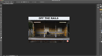
Poster Practical - Part two
After the first stages of the poster which was adding in the image editing it and the title and age rating I went onto to do more.
After the first stages of the poster which was adding in the image editing it and the title and age rating I went onto to do more.
First of all I changed the font of our title to our chosen font that is 'Bebas Neue' I downloaded it on to the mac where I could access it from Photoshop. By having the font downloaded I was able to add in the rest of the text onto the poster such as the tag line that is 'Money is the route of all evil' I made it smaller then the title as this is one of the conventions of posters. I made the colour green as this is our chosen colour for our film.
I then added in our 'By the director of' we chose the director of 'Fishtank' as its likely our film would be made by this producer as it is a low budget film. I thought it would look best on the bench where it would stand out, I decided to changed 'Fishtank' to our green colour just to add another aspect and incorporating our colour more. After that I put in 'Coming Soon' at the bottom in the same text and green, I went onto Google where I found our production companies logo that is 'legendary' I imported this into Photoshop and put in next to our age rating as this is where it usually is seen.
I added in our critics reviews which we had already planned out what they were going to say. I made sure they were in the right position for our poster and size, I had to move them down as you could see the black text on the black background. I then used the custom shape tool to add in the stars for the reviews this was hard as I had to make sure they were all the same size. When I added these in being 5 on the first review and 4 on the second I changed the colour of them to green, I used the selective colour tool where I went onto the tag line and selective the colour green I used on that so the same green could be used throughout.
I then searched for a billings block template and font, I finally found one on video co pilot after downloading the font and template I imported it into Photoshop.
I then edited the text relevant to our film such as our producers and actors. After typing the right text and editing it I copy merged it on to the poster. When it first went on the colour was too dark and made it unable to see, so I changed the colour to a light grey/white so that it was viable.
This was what the poster then looked like. We decided that we needed to have an aspect of the light grey/white somewhere else on our poster, we thought that our critics reviews was hard to read to changed them. We also decided that it didn't look right not having our title and tag line central with the pillars so we moved it over to be in line. I also changed our production company logo the other side to make it look even, I had to change the colour of it to the same white/grey as it wasn't visible.
This is our finishing poster.
Overall I am extremely pleased with how our poster looks, I had to be particularly careful with the colour scheme and placing's other wise it wouldn't of looked right. If I was to-do this again I'd use a clearer camera as our image is a litter bit bluer than I wanted, and I would of also paid more attention on the lighting as we had to work around the dark shadow. However I am happy with how it has turned our and feel it looks professional.


No comments:
Post a Comment