Audience feedback
After submitting our first draft of our trailer, website and poster we then received some feedback from other media students in year 12 and year 13. This feedback included both constructive criticism and things in our piece that were good/ effective.
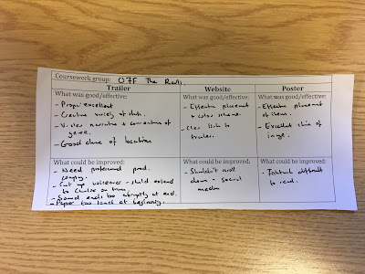
Below is an example of a feedback sheet that was given to our audience to fill out. This response included detailed and effective answers:
Website feedback
General responses our audience gave:
What was good/ effective:
- Video on loop of the main character sitting at the station and a train arriving.
- Colour scheme
- Conventional to urban drama
- Trailer fit in window
- Clear link to trailer
What could be improved:
- Change colour of social media
- Make all features be seen without the viewer scrolling down.
- "Off The Rails" too close to top of station
Above shows suggestions for improvements to our website in which our audience gave us. However some of these suggestions I would say are inaccurate or do not need to be added or changed in our piece.
 |
Here is a screenshot of our website which was shown to our audience. There are clearly some minor issues due to the limited responses for improvements. |
Trailer feedback
General responses our audience gave:
What was good/ effective:
- Creative variety of shots
- Very clear narrative
- Good choices of location
- Effective use of props
What could be improved:
- Cut up voiceover.
- Reduce sound of some of the shots clips.
As my other group members had already cut up the voiceover, i chose to edit some of the sound throughout the piece taking our audience feedback into consideration.
 |
| I went through our piece and detached the audio of some clips that I didn't think fit well and deleted the audio making the audio of the voiceover sound more effective and more clear. |


No comments:
Post a Comment